
High-Quality Basics That Aren’t See-Through: What to Look For
What if a basic that looks opaque in a product photo changes the moment you put it on? Finding high-quality basics that aren't see-through takes more than trusting a polished image or a premium-sounding label. Light, pale color, an open knit, and fabric stretched across the body can all reveal what a still photo hides.
That uncertainty is familiar. Fabric weight matters, but it isn't a verdict on quality or a guarantee of opacity. Construction, fiber, color, fit, and lighting all shape how a garment behaves. A piece can feel substantial in your hands and still let light through in the areas that matter.
This guide will help you assess those details. You'll learn what fabric specifications can and can't tell you, how color and construction affect coverage, and how to check a basic in bright light and under gentle tension. A few practical checks can replace vague claims with a more considered choice.
Key Takeaways
- Opacity depends on the conditions a garment faces, so a mirror or product photo may not tell the whole story.
- Compare fabric weight alongside color, knit or weave, stretch, and layering. No single detail proves a basic will stay opaque.
- Use a simple inspection sequence to see how fabric looks at rest, against light, and under gentle tension.
- Choose high-quality basics that aren't see-through by weighing garment details against your comfort and coverage preferences, not vague quality claims.
- Memento Mori Clothing describes its Memento Side-Zipped Hoodies as soft cotton with unique side zippers. Those details alone don’t establish opacity.
Why high-quality basics can still be see-through
A shirt can seem opaque in a fitting-room mirror, then look different in daylight or in a photo taken from another angle. That can be frustrating, especially when the fabric feels substantial and the label suggests careful quality. But quality and opacity answer different questions. A well-made garment can still allow light or underlying detail to show in certain conditions.
Opacity is not a fixed verdict you can reach by touch alone. Light, fabric construction, color, fit, and the surface beneath the garment all shape what you see. The Textile overview is a useful foundation for understanding how fibers and fabric construction influence a material’s properties, but a garment’s behavior still needs to be judged in context.
What does “not see-through” mean in practice?
Opacity is how much light or underlying detail a fabric allows through under particular conditions. A fabric may transmit light without making skin, color, or garment details clearly visible. It may also reveal those details when held against a bright window, worn over a contrasting color, or stretched across the body.
“Not see-through” depends on how you intend to wear the garment. Consider its color, how closely it fits, what you plan to wear underneath, and the lighting where you expect to wear it. A pale top may need to meet a different coverage standard than a dark one. There’s no single threshold for everyone, so include your own comfort in the assessment.
Why product photos can give a misleading impression
Product photography shows a garment under selected conditions. Studio lighting, camera exposure, styling, and image editing can affect how much fabric texture or underlying detail appears. A model may be posed with the fabric smooth and unstretched, while a close crop or bright background makes comparison difficult.
A still image has limits. It can’t show how a shirt behaves when you raise your arms, bend, or move through different light. Nor can it reveal exactly what happens when fabric pulls across the chest or shoulders. Treat photos as one source of information, not proof of how the garment will look on your body.
Read the material description alongside the images, and look for specifics such as fiber content, fabric weight, and construction when provided. If you can assess the garment directly, compare it at rest and under the light and gentle tension it may face in wear. Those observations are more useful than a vague claim of “premium” quality.
That is the more considered path to high-quality basics that aren't see-through: assess fabric, color, construction, fit, and lighting together. No label can make that judgment for you. The following sections turn those factors into practical comparisons and checks, so your choice rests on what the garment actually does, not only on how it is described.
How fabric weight, color, and construction affect opacity
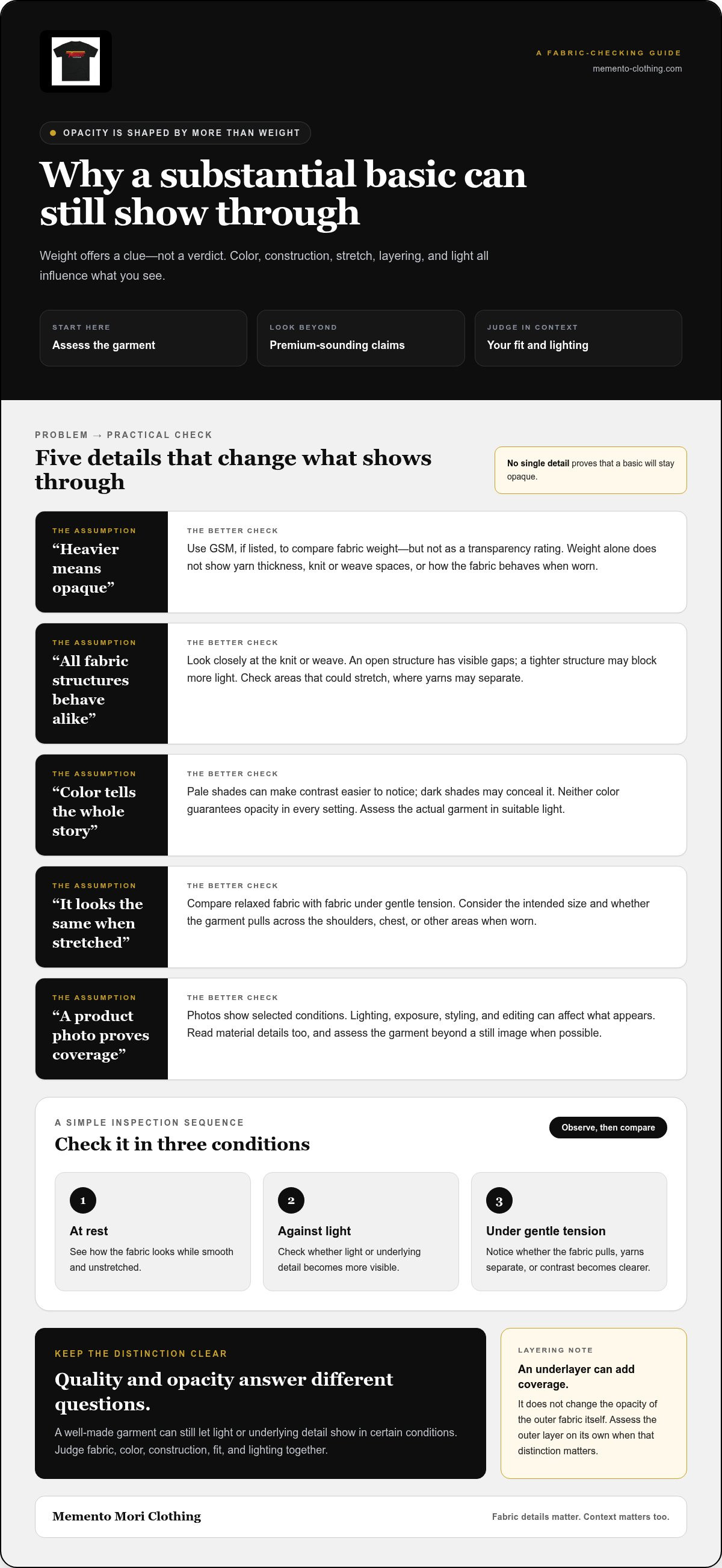
Opacity depends on several details working together. Fabric weight can offer a useful clue, but yarn, knit or weave, color, and how the garment sits on the body also matter. Two garments with similar weight may let through different amounts of light, so compare the whole fabric and garment rather than relying on one specification.
Does heavier fabric always mean less sheerness?
Weight can help you compare fabrics, but it can’t promise opacity. GSM, or grams per square meter, describes fabric weight and can help distinguish a lighter cloth from a heavier one. Yet weight doesn’t tell you everything about yarn thickness, the spaces in a knit or weave, or how the fabric behaves when worn. Don’t choose by weight alone. Treat it as one clue among several.
A compact comparison can help turn product details into questions worth checking:
- Weight: More weight may suggest a denser, more substantial fabric. Check the GSM if listed, but don’t treat it as a transparency rating.
- Weave or knit: A tighter structure may block more light than an open one. Look closely at the spaces between yarns, especially in areas likely to stretch.
- Color: Pale shades can make underlying contrast easier to notice, while dark shades may conceal it. Check the actual color in suitable light rather than assuming either is opaque.
- Stretch and fit: Tension can spread yarns apart and make fabric look less opaque. Consider whether it stays relaxed or pulls across the body in the intended size.
- Layers: A lining or separate underlayer may add coverage, but it doesn’t change the opacity of the outer fabric itself. Assess the outer layer on its own if that distinction matters to you.
Why color, knit, and stretch change what shows through
Color affects contrast as well as light. A dark fabric may make skin or an underlayer less noticeable, but that doesn’t establish that it blocks more light in every setting. Pale fabric can reveal a contrasting layer more readily, yet its actual coverage still depends on construction and fit. Judge the garment you’re considering, not a rule about its color.
Construction matters at close range. An open knit has visible gaps, while a denser structure may have fewer. Even a closely constructed fabric can behave differently once stretched over the shoulders, chest, or knees. Compare a relaxed section with one under gentle tension, and note whether the yarns separate or the underlying contrast becomes clearer.
Think of layering as a styling choice, not proof that an outer fabric is opaque. If you prefer a single layer, evaluate that layer on its own. If you’re comfortable wearing an underlayer, consider how the pieces look together and whether the added layer suits the garment’s fit and feel. For a considered wardrobe choice, you can also explore Memento Mori Clothing’s apparel with your own priorities in mind.
How to compare basics for opacity without relying on vague quality claims
A product description can sound reassuring while leaving the most useful questions unanswered. “Premium,” “soft,” and “well-made” may describe a garment’s feel or positioning, but they don’t tell you how much light passes through it or what happens when it’s worn. To compare high-quality basics that aren't see-through, look for evidence about the garment itself, then separate what’s stated from what you’re inferring.
Which product details are useful, and which are not enough?
Start with information that helps you picture the fabric and how it sits: fiber content, fabric weight if provided, knit or weave, color, cut, and any lining. Look for close-up photos that show the construction, but remember they can’t establish how the fabric behaves on a body. Words such as “soft” and “premium” may matter to your preferences, yet neither is a measure of opacity.
For example, Memento Mori Clothing describes its Memento Side-Zipped Hoodies as soft cotton with unique side zippers and a buttoned hood printed with “Believe in Yourself.” Those are useful material and design details, but they don’t establish whether the fabric is opaque. Keep the stated facts distinct from assumptions based on the material name, brand, or price. For more garment-specific context, read the Memento Mori Vintage Tee buying guide.
How to compare two basics side by side
Make the comparison fair. Choose garments in similar colors and cuts, and consider how you plan to wear each one. Comparing a relaxed dark tee with a fitted pale one won’t reveal whether differences come from fabric, shade, or tension. Record the details each listing actually provides before letting polished photography influence your judgment.
- Note the stated fabric details: Record fiber content and fabric weight if available. Mark missing information as unknown rather than filling the gap with a guess.
- Inspect construction: Look for visible knit or weave structure, lining, and seams. Treat photos as clues, not a physical test.
- Compare color and cut: Keep these as similar as possible, then consider where the garment may pull or stretch during wear.
- Account for layering: Decide whether you expect the basic to be worn alone or with another layer. Keep that preference separate from the outer fabric’s own opacity.
This method doesn’t declare one material universally best. A fabric may offer a useful balance of weight, feel, and construction for one person, while another shopper prioritizes a different fit or layering approach. If a listing gives little detail, treat that as a limit on what you can conclude. Don’t turn a quality adjective into proof. Reserve your judgment for observable construction and, where possible, a hands-on check.
How to test whether a basic is see-through before wearing it
A few simple checks can reveal how a garment behaves beyond its product photo. They won’t certify its performance in every setting, but they can help you decide whether its coverage feels right for the way you plan to wear it. Use a representative area of the fabric and handle it gently.
A simple light-and-stretch check
Assess the fabric in stages. Keep the lighting and background consistent as you compare it at rest and under gentle tension. If you’re in a store, choose a discreet area and avoid pulling hard, especially around seams or delicate knit structures.
- Look at the garment at rest. Hold a single layer in front of a plain background. Notice whether you can see skin, a contrasting color, or details beneath it without adding tension.
- Move it near a bright light source. Hold the fabric toward a window or lamp, without placing it against a hot bulb. Check whether light passes through and whether underlying shapes or colors become easier to distinguish.
- Apply gentle tension. Stretch a representative area only as much as it might be pulled during wear. Compare it with the same area at rest, watching for gaps between yarns or clearer visibility of what’s behind the fabric.
- Check more than one area. If the garment has panels with different construction, inspect each relevant section. A sleeve, body panel, or seam area may behave differently.
Check the garment in the conditions you plan to wear it
Light changes what you notice. If possible, repeat the check in ordinary indoor light and near daylight. A garment that looks covered in a dim fitting room may reveal more detail by a bright window. Focus on the settings that matter to you instead of trying to predict every possible lighting condition.
Consider fit and movement, too. If you can try the garment on, see how it looks when you reach, bend, or sit, paying attention to areas where the fabric pulls. A relaxed panel may appear different once it’s stretched across the body. Don’t force a fit test on a garment you can’t try on. Use the fabric check as one piece of evidence instead.
If you intend to wear an underlayer, assess the complete outfit as well as the basic on its own. A contrasting layer can make visibility easier to judge, while a similar color may blend in. Decide whether the result suits your preference and planned outfit. These checks inform a personal choice; they aren’t a guarantee of how every garment will perform after movement, washing, or changes in light.
Use the same calm attention when choosing apparel for everyday wear. Explore Memento Mori apparel and consider how each garment fits your own standards for comfort and coverage.
Choosing intentional basics, and what Memento Mori Clothing can say about its garments
A considered choice rests on evidence, but it also rests on how you want to feel wearing the garment. No single specification can decide your opacity threshold for you. The goal is to understand what the details suggest, notice what remains unknown, and choose according to your comfort and intended use.
How to make a considered choice that suits your wardrobe
Bring the five factors together: fabric, color, construction, fit, and lighting. Fabric details can offer clues; color affects how visible contrast may be; construction shapes the spaces in the material; and fit can put fabric under tension. Lighting changes what you see. Consider each factor in relation to the outfits and settings where you expect to wear the basic.
For example, someone choosing a pale, close-fitting top to wear alone may have a different coverage standard from someone choosing a darker, relaxed layer. Neither preference is more correct. Ask yourself what you want the garment to cover, whether you plan to layer, and whether you feel at ease in the conditions you tested. If an important detail is missing, treat it as unknown rather than filling the gap with a quality claim.
Fit deserves particular attention because it affects both comfort and how fabric sits on the body. When considering a garment, compare the stated fit information with your own preferences and how you plan to wear it. Use product details to inform your decision, then let your intended wear and personal comfort set the final standard.
What the confirmed Memento Mori garment details establish
Memento Mori Clothing describes the Memento Side-Zipped Hoodies as soft cotton, with unique side zippers and a buttoned hood printed with “Believe in Yourself.” Those details identify the stated material and design features. They do not establish opacity, fabric weight, lining, or how the hoodies perform under different lighting or fit conditions. A material description should remain just that, not a substitute for evidence about coverage.
The Memento Side-Zipped Hoodies, the Memento Hockey Jersey, and the Mighty Mori Hockey Jersey are currently sold out and unavailable for purchase. Their status is clear; it does not establish anything about future availability. The same careful distinction applies to any garment: state what is known, avoid turning an assumption into a promise, and assess opacity separately according to your own needs.
That restraint is part of choosing well. Look closely, test what you can, and accept that a product description may not answer every question about how a garment will look on you. If you’d like to explore the brand and its garment details, explore Memento Mori Clothing. Use the information as context, not as a promise of availability or opacity.
Choose with care, then make the choice your own
A well-chosen basic earns its place through more than a label. It should feel right in the life you actually lead, offering comfort and confidence without asking you to ignore what matters to you. Let your own standard guide the decision. The details are there to help you choose, not to replace your judgment.
Memento Mori Clothing’s mission, “New Season. New Perspective,” reflects choosing with intention. The Memento Side-Zipped Hoodies are described as soft cotton, with unique side zippers and a buttoned hood printed with “Believe in Yourself.” Those are details of material and design, not a promise about opacity. Keep that distinction in mind as you consider high-quality basics that aren't see-through.
Clothing becomes part of ordinary days and lasting memories. Choose pieces with attention to how they feel, how they fit your wardrobe, and what their details genuinely tell you. A thoughtful choice needn’t be perfect. It simply needs to feel like yours.
Explore Memento Mori Clothing to discover the brand’s perspective on apparel. May your next choice bring a little more clarity, comfort, and confidence to the days ahead.
Frequently Asked Questions
Is heavier fabric always less see-through?
No. Heavier fabric can be a useful clue, but weight alone can’t guarantee opacity. A dense, dark fabric may conceal more than a heavier fabric with an open construction or pale color, while fit and lighting can change what’s visible. If a listing gives a weight, use it for comparison, not as a verdict. Check the garment in the kind of outfit and setting you have in mind.
Can white basics be completely opaque?
Some white garments may look opaque in ordinary indoor conditions, while others show more detail near a bright window or when worn under tension. The result depends on the particular fabric, construction, fit, and setting, so white alone can’t settle the question. For demanding environments where white clothing must deliver reliable coverage, workwear specialists such as White Wear prioritize dense weaves and substantial fabric weights. If you plan to wear a white top outdoors, consider how it looks in daylight with the underlayer you intend to wear.
How can I tell if a shirt is see-through before buying it online?
Start with the stated material and construction details, then compare available images, especially close-ups and views from different angles. Look for descriptions of lining or other layers, but don’t treat “premium” or “soft” as proof of coverage. Photos can’t show exactly how fabric behaves on your body. Use the available details to narrow your assessment, then inspect the physical garment when you can.
What fabric is best for basics that aren’t see-through?
There isn’t one fabric name that guarantees coverage across every garment. Construction, color, fit, and lighting can all affect how a particular cloth looks, even when two basics share a fiber. Compare the specific garment descriptions rather than choosing by material label alone. If you can inspect the item, look at it relaxed, then apply gentle tension and notice whether the visible detail changes.
Does stretching make a basic more see-through?
It can. In some garments, stretching opens the structure or makes the fabric appear thinner, so skin or an underlayer becomes more noticeable. The effect varies, and a hanger won’t reveal how a close-fitting shirt behaves across the shoulders or chest. If inspecting in person, gently test an area likely to stretch and compare it with the relaxed fabric. Avoid pulling hard or stressing seams.
Can a soft cotton hoodie be assumed to be opaque?
No. Softness and fiber content alone don’t establish opacity; construction, color, fit, and lighting also affect what shows through. Memento Mori Clothing describes its Memento Side-Zipped Hoodies as soft cotton, but that detail doesn’t establish that they’re opaque. The Memento Side-Zipped Hoodies are currently sold out and unavailable for purchase.
What should I do if my basics look opaque indoors but sheer in daylight?
Decide based on the light in which you expect to wear the garment, since daylight can make details more visible than indoor lighting does. Try it with your intended outfit and consider whether the result feels comfortable to you. If you’ve already bought it, follow the care label. Don’t rely on washing or an unverified treatment to change its opacity.